| Client: | MOSER |
|---|---|
| Branch: | Hairdressing supplies, hair clippers |
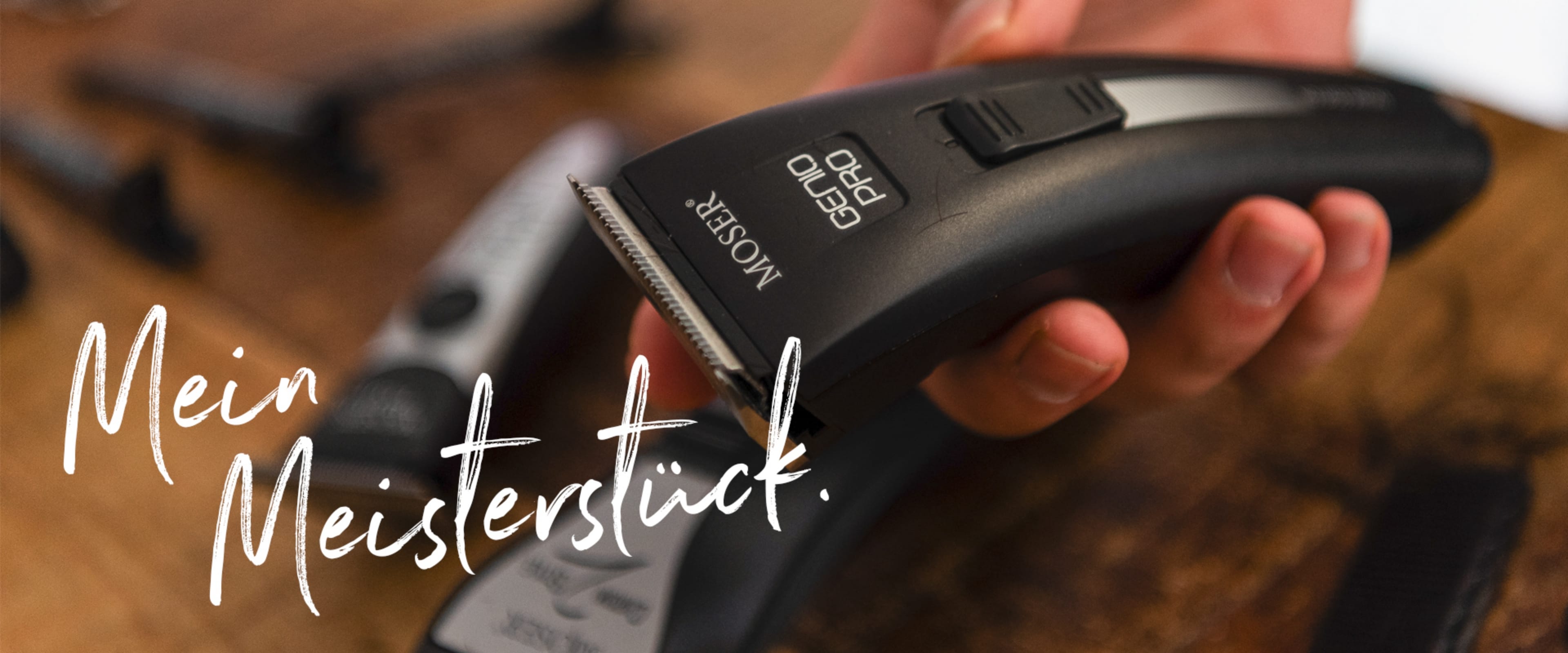
| Job: | Well mastered: the new positioning and brand identity for MOSER, one of the world's best-known manufacturers of hair clippers for professionals. Our 'My masterpiece' strategic campaign idea combines the high product quality of MOSER with the pride of hairdressers in their performance – and immediately appealed to the client. On this basis, we developed the complete relaunch of the brand in time for the company's 75th anniversary, introducing a new colour scheme, revised logo, new text tonality and a fresh corporate design for print and online media as well as trade fairs. Our highlight: bold texts and the red 'O' as a playful design element. |
MOSER BRAND RELAUNCH:
OUR MASTERPIECE


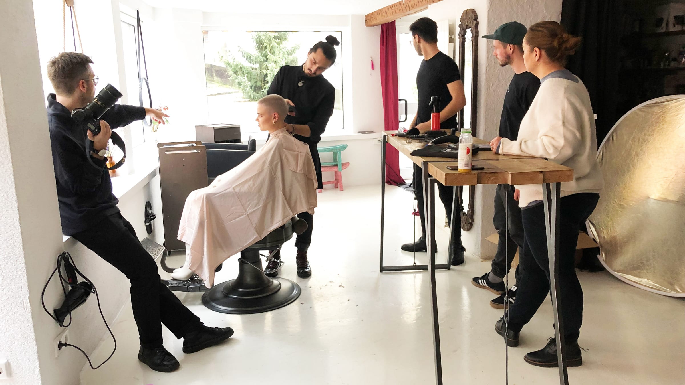
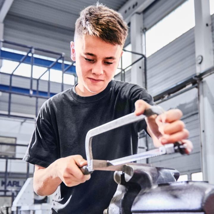
MOSER Making-of
Our photo shoots at the local hairdressers define the new look of MOSER and show the masters at work. The campaign "My Masterpiece" becomes tangible.
Reduction to the essential
Our aim in re-designing the MOSER logos was to harness and strengthen the power and visibility of the established brand mark by reducing and 'polishing' the content.
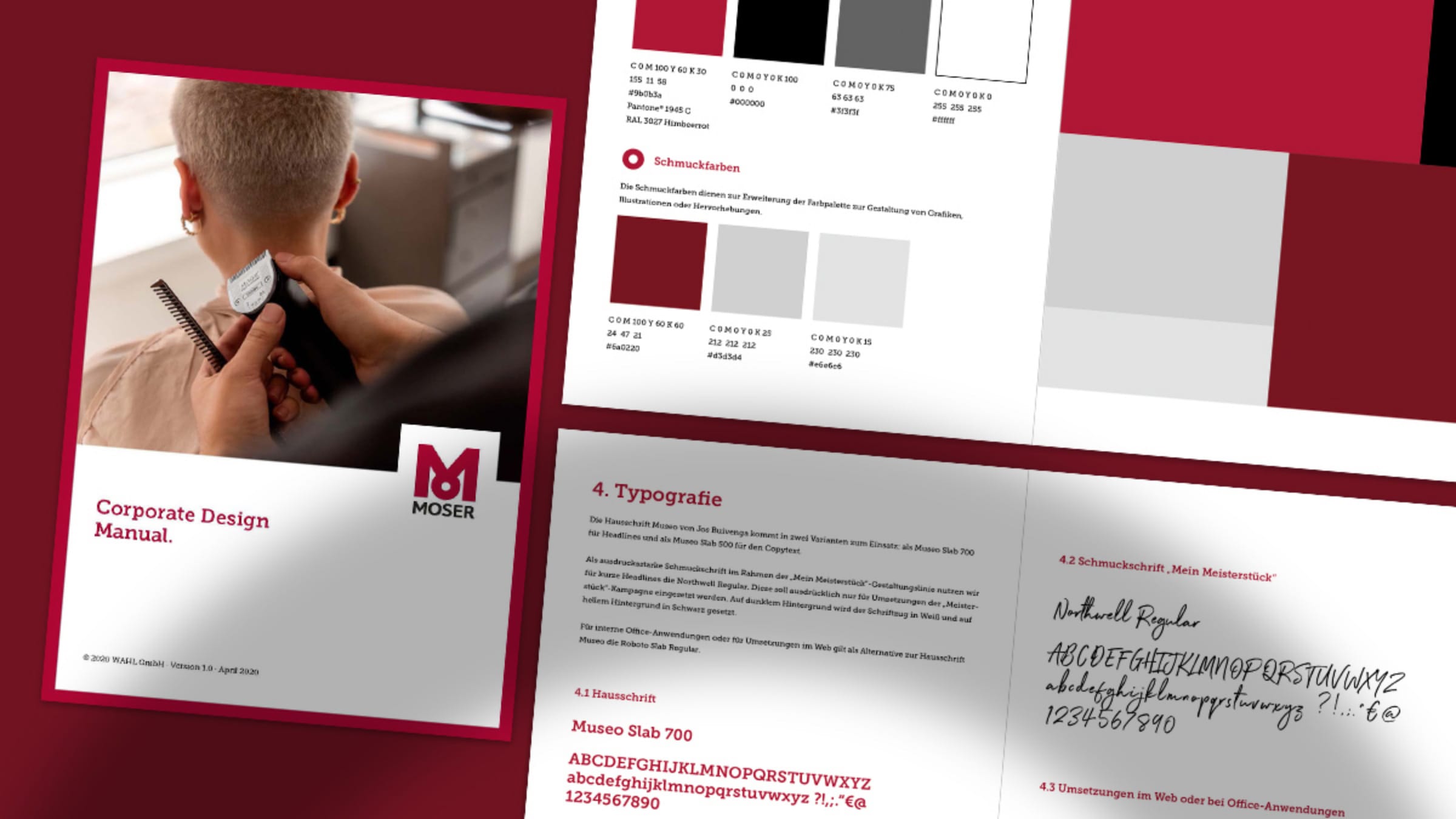
The Corporate Design manual
Our CD manual for MOSER also provides the internal design with the guidelines for implementing the numerous international advertising materials.